Choosing the best color for your kitchen can change the entire feel of your home. Imagine walking into a space that instantly lifts your mood and makes cooking more enjoyable.
The right color doesn’t just look good—it can make your kitchen feel bigger, brighter, and more inviting. But with so many options out there, how do you pick the perfect shade that fits your style and daily life? Keep reading, and you’ll discover simple tips and surprising insights that will help you find the color your kitchen—and you—will love.
Popular Kitchen Colors
Choosing the right color for your kitchen sets the mood and style of the space. Popular kitchen colors offer a variety of vibes, from bright and energetic to calm and cozy. These colors suit different tastes and kitchen designs. Here are some favorites that homeowners love.
Classic White
White kitchens feel clean and bright. They make small spaces look bigger. White works well with all cabinet styles and countertop colors. It creates a timeless look that never goes out of style. White also reflects light, making the kitchen feel fresh and airy.
Bold Reds
Red adds energy and warmth to the kitchen. It sparks appetite and conversation. Red pairs well with neutral tones like white or gray. Use it on cabinets, walls, or accents to create a lively atmosphere. Bold red kitchens stand out and feel inviting.
Soothing Blues
Blue brings calm and relaxation to the kitchen. Soft blues feel gentle and cool. Dark blues offer depth and elegance. Blue pairs nicely with white or wood tones. It’s a good choice for those who want a peaceful cooking space.
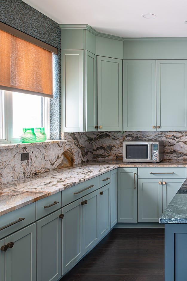
Earthy Greens
Green connects the kitchen with nature. It feels fresh and natural. Shades from sage to olive work well in kitchens. Green creates a cozy, restful space. It matches wood and stone materials beautifully. Earthy greens help bring balance to the room.
Warm Neutrals
Warm neutrals include beige, taupe, and soft browns. These colors make kitchens feel cozy and welcoming. They work well with wood and metal finishes. Warm neutrals create a soft background that highlights other design elements. This palette suits classic and modern kitchens alike.

Credit: www.goodhousekeeping.com
Color Psychology In Kitchens
Colors have a strong effect on how people feel and behave in a space. In kitchens, colors influence mood, energy, and even appetite. Choosing the right color can make cooking and dining more enjoyable. Understanding color psychology helps pick shades that fit your kitchen’s purpose and vibe.
Energizing Shades
Bright colors like red, orange, and yellow boost energy and excitement. They create a lively atmosphere that encourages activity. Red can stimulate conversation and appetite. Orange adds warmth and friendliness. Yellow brings cheerfulness and brightens the space. These colors work well in kitchens where energy and social interaction are key.
Calming Tones
Soft blues, greens, and neutrals create a relaxing kitchen environment. These colors reduce stress and promote calmness. Blue tones help cool down emotions and improve focus. Green connects to nature and refreshes the mind. Neutral shades like beige or soft gray offer balance and simplicity. Calming tones suit kitchens used for quiet meals or peaceful cooking.
Appetite Stimulants
Certain colors can increase hunger and food enjoyment. Warm colors, especially red and orange, are known appetite boosters. They make food look more appealing and inviting. These colors are perfect for kitchens and dining areas where you want to encourage eating and sharing meals.
Mood Enhancers
Colors can lift spirits and improve mood in the kitchen. Bright yellows and soft pinks bring happiness and positivity. Light blue and lavender add a gentle, soothing feeling. Using these hues can make your kitchen a joyful place to spend time in. Mood-enhancing colors help create a welcoming, happy kitchen space.
Choosing Colors By Kitchen Style
Choosing the right color for your kitchen means understanding the style you want to highlight. Each kitchen style has colors that not only fit its look but also boost the mood and function of the space. Think about what feeling you want every time you step into your kitchen and let that guide your color choice.
Modern Minimalist
For a modern minimalist kitchen, colors need to be clean and simple. Whites, grays, and black create a sleek, uncluttered look that helps your space feel larger and more open. Adding a pop of color with bright red or deep blue on an accent wall or accessories can make the design stand out without overwhelming.
Have you tried pairing matte finishes with glossy surfaces? This contrast keeps the modern vibe fresh and interesting.
Rustic Charm
Rustic kitchens call for warm, earthy tones like soft browns, deep greens, and rich creams. These colors bring out the natural materials often used, such as wood and stone. Using mustard yellow or burnt orange accents can add a cozy, welcoming touch that feels like home.
Would you consider mixing vintage patterns with these tones to add personality? It’s a simple way to keep the rustic charm alive.
Traditional Elegance
Traditional kitchens look best with classic colors like navy blue, forest green, or warm beige. These hues add sophistication without feeling cold. Pairing these colors with white trim or cabinetry helps keep the space balanced and timeless.
Think about the last traditional kitchen that caught your eye—did the colors make you feel calm or inspired? Choosing shades that evoke those emotions can make your kitchen a favorite spot.
Industrial Look
Industrial kitchens thrive with darker, more muted colors like charcoal gray, black, and metal tones. These shades match well with exposed brick, concrete, and stainless steel. Adding hints of copper or rust can bring warmth and break the monotony of the darker palette.
How can you use lighting to enhance these colors? Bright, focused lights can highlight textures and create a dramatic effect that suits the industrial vibe perfectly.

Credit: www.goodhousekeeping.com
Combining Colors For Impact
Combining colors in the kitchen creates a lively and inviting space. The right mix highlights features and adds personality. Using different tones and shades brings depth and balance to the room. Thoughtful color combinations can make your kitchen feel larger, warmer, or more modern. Small changes in color pairing can have a big visual impact.
Accent Walls
Accent walls add a splash of bold color without overwhelming the space. Choose a wall that naturally draws attention, like behind the stove or sink. Deep blues, rich greens, or warm terracotta work well for accent walls. These colors contrast with neutral tones on other walls. This contrast creates a focal point and adds energy to the kitchen.
Cabinet And Countertop Pairings
Matching cabinets and countertops involves finding colors that complement each other. Light cabinets pair nicely with dark countertops for a sharp contrast. Dark cabinets look elegant with lighter, neutral countertops. Neutral shades like white, gray, or beige work well with most colors. Consider the finish too: matte and glossy surfaces change how colors appear.
Backsplashes And Accessories
Backsplashes offer a chance to add pattern and texture through color. Tiles in blues, greens, or metallics bring a fresh look. Accessories like rugs, towels, and small appliances can echo backsplash colors. These accents tie the whole design together. Using similar colors in accessories and backsplashes creates harmony and style.
Lighting And Color Interaction
Lighting plays a crucial role in how kitchen colors appear. The interaction between light and color changes the mood and feel of the space. Choosing the right color depends on understanding this relationship.
Natural Light Effects
Natural light brings out true colors in the kitchen. It changes throughout the day, shifting from warm to cool tones. South-facing kitchens get bright, warm light that enhances warm colors like reds and yellows. North-facing kitchens have softer, cooler light, which suits blues and greens well.
Large windows allow more natural light, making colors look vibrant. Smaller windows or shaded spaces may make colors appear duller. Light reflection from surfaces like countertops also affects how colors show.
Artificial Lighting Choices
Artificial lights can alter color perception significantly. Warm white bulbs add a cozy feel and deepen warm tones. Cool white bulbs highlight cool colors and make the kitchen look modern. LED lights offer flexibility with adjustable brightness and color temperature.
Layering different light sources, such as overhead, task, and accent lights, creates balance. Light placement impacts shadows and highlights, changing how colors appear on walls and cabinets.
Color Changes By Time Of Day
Colors look different in the morning, afternoon, and evening. Morning light is usually soft and cool, making colors seem muted. Afternoon light is brighter and warmer, making colors more vivid. Evening light is dimmer and warmer, softening colors and creating a calm atmosphere.
Consider how your kitchen will be used during the day. Choose colors that stay pleasant and inviting under various lighting conditions.
Trendy Kitchen Colors 2024
The colors you choose for your kitchen in 2024 can set the entire mood of the space. This year, the palette is bold yet inviting, mixing calmness with a touch of drama. Are you ready to transform your kitchen into a stylish hub that reflects your personality and keeps up with the latest trends?
Soft Pastels
Soft pastel shades like mint green, blush pink, and powder blue are making a strong comeback. These colors bring a fresh, airy feel without overwhelming the senses.
Imagine starting your day with a cup of coffee in a kitchen painted in gentle mint green—it instantly lifts your mood. These hues work well with natural wood and white accents, creating a perfect balance between warmth and lightness.
Deep Jewel Tones
If you want your kitchen to feel rich and luxurious, deep jewel tones like emerald, sapphire, and amethyst are excellent choices. These colors add depth and sophistication to any kitchen design.
Think about pairing a deep emerald cabinet with brass hardware—it’s a combination that feels both modern and timeless. Are you ready to make a bold statement with color that demands attention?
Matte Finishes
Matte finishes continue to dominate kitchen surfaces in 2024. They provide a smooth, understated look that reduces glare and hides fingerprints better than glossy finishes.
Imagine running your hand over a matte black countertop—there’s something tactile and pleasing about it. Choosing matte finishes can instantly elevate your kitchen’s style while keeping maintenance low.
Metallic Accents
Metallic accents are the perfect way to add a hint of sparkle without going overboard. Think brushed gold, copper, or matte black fixtures and handles that contrast beautifully with your base colors.
You could have sleek copper pendant lights over a pastel island or matte black taps against deep jewel cabinets. These small touches make a big impact and invite you to experiment with texture and shine.
Tips For Testing Kitchen Colors
Choosing the best color for your kitchen is exciting but testing those colors before committing can save you from costly mistakes. It’s easy to be swayed by a paint chip, but the real test happens in your space with your lighting and surroundings. Trying out different methods to see how colors behave helps you make a confident decision that fits your style and kitchen environment.
Sample Paint Swatches
Start by picking up small paint swatches or sample pots of your favorite colors. Paint patches directly on your kitchen walls in various spots—near windows, corners, and by the cabinets.
Observe these swatches at different times of the day. Natural light changes how colors look, so a shade that seems perfect in the morning might feel dull by evening. This hands-on approach gives you the clearest idea of how a color interacts with your space.
Using Virtual Design Tools
Virtual design tools let you upload photos of your kitchen and digitally apply different colors. These tools are handy when you want to quickly compare multiple shades without lifting a brush.
Try adjusting the lighting settings in the app to mimic your kitchen’s natural and artificial light. While these tools aren’t foolproof, they provide a useful preview and can narrow down your choices efficiently.
Considering Room Size And Layout
Your kitchen’s size and layout impact how a color feels. Lighter shades tend to open up small spaces, making them feel larger and airier. Dark colors can add warmth but might make a compact kitchen feel cramped.
Think about the flow between your kitchen and adjacent rooms. A color that clashes with nearby spaces can disrupt the overall harmony. Ask yourself, does this color enhance the room’s shape and lighting, or does it create awkward shadows and tight corners?

Credit: www.goodhousekeeping.com
Maintaining Color Vibrancy
Maintaining the color vibrancy in your kitchen keeps the space lively and fresh. Colors can fade or dull over time due to heat, light, and daily use. Simple care routines help preserve the brightness and charm of your kitchen’s color palette.
Cleaning Tips
Use mild cleaners to avoid stripping paint or finish. Wipe surfaces gently with a soft cloth or sponge. Avoid harsh chemicals that can cause fading or discoloration. Clean spills quickly to prevent stains. Regular dusting prevents buildup that dulls color.
Touch-up Solutions
Keep some paint or stain from your kitchen’s original color. Use it to fix small scratches or chips promptly. Match the color carefully for a seamless look. Touch-ups prevent damage from spreading and keep surfaces uniform. Test paint in a hidden spot first to ensure a match.
Long-term Color Care
Protect kitchen surfaces from direct sunlight to reduce fading. Use curtains or blinds to control light exposure. Avoid placing hot pots directly on painted surfaces. Use coasters and mats to protect counters. Regularly inspect surfaces and address wear early to maintain vibrancy.
Frequently Asked Questions
What Is The Best Kitchen Color For Small Spaces?
Light colors like white, pale gray, and soft pastels open up small kitchens. They reflect light, making the space feel larger and more inviting.
Which Kitchen Color Boosts Appetite And Warmth?
Warm colors like red, orange, and yellow stimulate appetite and create a cozy atmosphere. Use these hues as accents for a balanced look.
How To Choose A Kitchen Color That Matches Cabinets?
Select colors that complement or contrast your cabinets. Neutral walls work well with colorful cabinets, while bold walls enhance neutral cabinetry.
Are Neutral Colors Good For Kitchen Walls?
Yes, neutrals like beige, gray, and white provide a timeless, clean look. They also allow flexibility with decor and appliance styles.
Conclusion
Choosing the best color for your kitchen sets the room’s mood and feel. Soft, light shades create a calm space. Bright colors bring energy and warmth. Think about your kitchen’s size and light when picking colors. Personal style matters most.
A well-chosen color makes cooking and gathering more enjoyable. Start with simple tones, then add accents for balance. Your kitchen should feel inviting and reflect you. Color can change how you enjoy your home every day.
