Choosing the right color for your kitchen can completely change the way you feel in the space. Imagine walking into a kitchen that instantly lifts your mood and makes cooking more enjoyable.
You want colors that not only look great but also create the perfect atmosphere for your daily life. You’ll discover the best colors to paint your kitchen—colors that can make your space feel bigger, warmer, or more inviting. Keep reading, and you’ll find the perfect shade that speaks to you and transforms your kitchen into a place you love.

Credit: www.goodhousekeeping.com
Popular Kitchen Color Trends
Popular kitchen color trends reflect a mix of style and comfort. These colors create a warm and inviting space. They also add personality without overwhelming the room.
Many homeowners choose colors that balance modern and classic looks. The palette ranges from soft pastels to bold, rich tones. Each color trend suits different kitchen styles and moods.
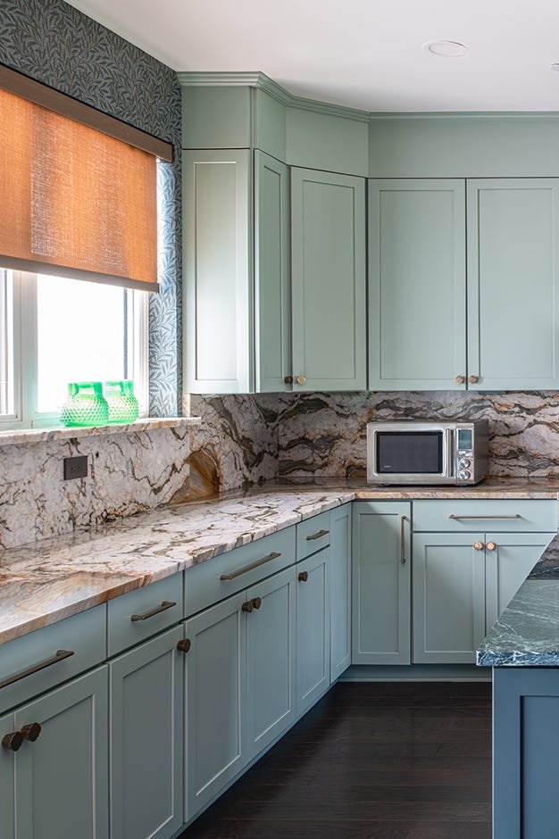
Neutral Tones For Timeless Elegance
Neutral colors like beige, gray, and white remain popular. They make kitchens feel clean and spacious. These tones work well with various cabinet styles and countertops. Neutral shades create a calm and flexible background.
Bold Blues And Greens
Deep blues and greens add depth and character. These colors bring a fresh, natural vibe to kitchens. They pair nicely with wood and metal finishes. Bold hues make a strong design statement.
Soft Pastels For A Light, Airy Feel
Pastel shades such as mint, blush, and light yellow brighten kitchens. They offer a gentle and cheerful atmosphere. These colors fit well in smaller kitchens. Pastels create a welcoming and cozy space.
Warm Earthy Colors
Warm shades like terracotta, mustard, and olive connect the kitchen to nature. They add warmth and comfort. Earthy tones match well with rustic and farmhouse designs. These colors make kitchens feel grounded and inviting.
Two-tone Cabinets
Mixing two colors on cabinets is trendy. Often, the upper and lower cabinets have different shades. This adds contrast and visual interest. Two-tone designs allow creativity without overwhelming the space.
Warm And Inviting Neutrals
Choosing warm and inviting neutrals for your kitchen walls creates a cozy atmosphere that welcomes everyone. These colors offer a subtle backdrop, allowing your kitchen’s features and decor to shine without overwhelming the space. They work well in kitchens of all sizes, making your cooking and gathering areas feel comfortable and timeless.
Creamy Whites
Creamy whites bring softness and warmth to your kitchen without the starkness of pure white. They reflect natural light beautifully, making the space feel bright and airy while adding a gentle touch of color. You might notice how creamy whites pair effortlessly with wooden cabinets or colorful kitchen accessories, enhancing their appeal.
Think about a kitchen where the walls are painted a soft cream—you instantly feel calm and relaxed. This color also hides fingerprints and smudges better than bright white, making it practical for busy kitchens. Have you ever considered how a simple shade of creamy white could make your kitchen look both fresh and lived-in?
Soft Beiges
Soft beiges add a natural, earthy tone to your kitchen that feels grounding and peaceful. This color works well with various materials like stone countertops and stainless steel appliances, offering a balanced look. If you want a color that blends with many design styles, soft beige might be your best choice.
Many homeowners find that soft beige creates a welcoming environment where guests feel at ease. It also serves as a perfect canvas for bold accent colors, such as navy blue or forest green, if you enjoy adding pops of color. What accent colors would you choose to complement a warm beige kitchen?
Bold And Vibrant Choices
Bold and vibrant colors bring energy and life into a kitchen space. These hues create a lively atmosphere that encourages creativity and socializing. Choosing strong colors makes your kitchen a standout feature in your home. It reflects personality and adds warmth to the room. Bright tones can make even small kitchens feel welcoming and dynamic.
Fiery Reds
Fiery reds energize any kitchen with their warmth and passion. This color stimulates appetite and conversation, perfect for dining areas. Red works well on walls, cabinets, or as an accent color. Pair it with neutral tones like white or gray for balance. Darker reds add a rich, cozy feel, while bright reds bring excitement and vibrancy.
Energetic Oranges
Energetic oranges create a cheerful and friendly kitchen environment. This color radiates warmth and positivity, making mornings brighter. Orange complements natural wood tones and stainless steel appliances well. Use it on a feature wall or kitchen island for a bold statement. Lighter oranges offer a soft glow, while deeper shades energize the whole space.

Credit: www.goodhousekeeping.com
Calming And Soothing Shades
Calming and soothing shades create a peaceful kitchen atmosphere. They reduce stress and invite relaxation. These colors make the kitchen a perfect space to enjoy meals and conversations. Soft hues bring warmth without overwhelming the senses. Choose tones that brighten but still feel gentle and fresh.
Serene Blues
Serene blues bring calm and clarity to the kitchen. They remind us of clear skies and calm seas. Soft blue shades make the room feel larger and more open. Pale blue walls pair well with white cabinets for a clean look.
Blue tones also encourage focus and calmness. They work well in busy kitchens to reduce noise and tension. Try powder blue or sky blue for a gentle touch. These hues match natural wood and stainless steel beautifully.
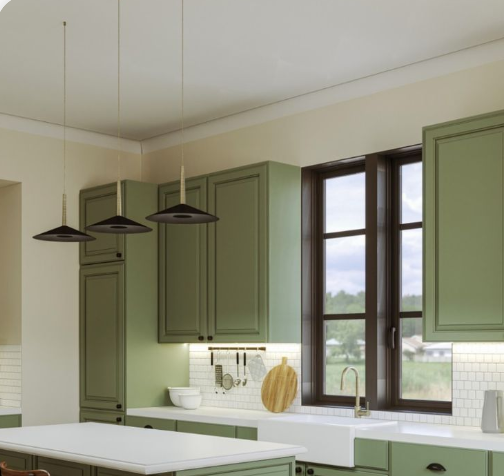
Tranquil Greens
Tranquil greens connect the kitchen with nature. Light green shades evoke fresh leaves and peaceful gardens. This color soothes the eyes and promotes relaxation. Soft greens create a refreshing and inviting space.
Mint, sage, and pale olive are great green choices. They blend nicely with wood and neutral tones. Green kitchens feel lively yet calm, balancing energy and peace. Use green paint on walls or cabinets to add subtle calmness.
Classic And Timeless Hues
Choosing the right color for your kitchen walls can shape the entire atmosphere of the space. Classic and timeless hues offer a safe yet stylish choice that withstands changing trends. These colors create a warm, inviting environment that feels fresh no matter how many years pass.
Elegant Grays
Gray is a versatile color that balances warmth and coolness perfectly. It pairs well with both modern and traditional kitchen designs, making it a smart pick for your walls.
Think about soft dove gray or a deeper charcoal shade. These tones add depth without overwhelming your kitchen. Plus, gray works beautifully with bold accent colors like mustard yellow or navy blue if you want to add personality.
Have you noticed how gray cabinets or backsplash can make your kitchen feel more spacious? Painting the walls in a matching or complementary gray can enhance that effect and keep your kitchen looking sleek.
Rich Taupes
Taupe blends brown and gray to create a warm, earthy tone that feels cozy and sophisticated. It’s a fantastic choice if you want your kitchen to feel grounded and welcoming.
Richer taupe shades bring out the beauty in natural wood cabinets and stone countertops. They also hide dirt and smudges better than pure whites or light neutrals, which can be a practical advantage in a busy kitchen.
Consider pairing taupe walls with cream or off-white trim to keep the space bright. This subtle contrast adds interest without breaking the calm, timeless vibe.
Credit: www.jswpaints.in
Modern And Trendy Palettes
Modern kitchens often make a bold statement through their color choices. Choosing the right palette can transform your space into a stylish and inviting hub. If you’re thinking about refreshing your kitchen, consider palettes that balance trendiness with timeless appeal.
Sleek Blacks
Black is no longer just a background color; it’s a powerful choice for kitchen walls and cabinets. Using sleek blacks creates a dramatic and elegant atmosphere that feels both modern and cozy.
Pair black paint with metallic hardware like brushed gold or matte silver to add a touch of luxury. You might be surprised how black walls make your kitchen appliances and accessories pop, turning everyday items into eye-catching features.
Wondering if black might make your kitchen feel smaller? Try balancing it with plenty of natural light and lighter countertops. This contrast keeps the space open while maintaining that chic edge.
Chic Charcoals
Charcoal gray offers a softer alternative to pure black without losing the modern vibe. It’s versatile, working well with both warm and cool tones, giving you more freedom in your kitchen design.
Charcoal walls look fantastic paired with white trim or open shelving, which can add depth and brightness. Think about combining charcoal with natural wood elements to bring warmth and texture to the room.
Have you considered how a charcoal palette might complement your kitchen’s lighting? Even subtle changes in lighting can shift charcoal’s mood, making your kitchen feel inviting at any time of day.
Choosing The Right Finish
Choosing the right finish for your kitchen paint is just as important as selecting the color itself. The finish affects the look, feel, and durability of your kitchen walls and cabinets. It also impacts how easy it is to clean and maintain your space, especially in a busy kitchen environment.
Glossy Vs Matte
Glossy finishes reflect light and create a shiny, polished look. They make colors appear brighter and can add a modern touch to your kitchen. However, glossy paint shows imperfections like scratches and dents more easily.
Matte finishes absorb light, giving a softer, more subtle appearance. They hide surface flaws better, making your kitchen look smooth and clean. But matte paint can be harder to clean, which might be a concern in areas prone to splashes and stains.
Durability Considerations
Durability is key in a kitchen where walls and cabinets face moisture, heat, and frequent cleaning. Semi-gloss and satin finishes offer a good balance—they resist moisture well and are easier to wipe down.
Think about your kitchen’s traffic and activity level. If you cook a lot and have kids or pets, a more durable, washable finish will save you time and effort. Would you prefer a finish that stands up to daily messes or one that offers a cozy, muted look?
Incorporating Accent Colors
Adding accent colors to your kitchen can transform the space from ordinary to extraordinary. These colors bring energy and personality without overwhelming the room. You get to play with boldness and subtlety, balancing the main palette with pops of creativity.
Statement Walls
A statement wall can instantly draw the eye and create a focal point in your kitchen. Choose a vibrant color like deep teal, mustard yellow, or rich burgundy to make one wall stand out. This works especially well behind open shelves or a dining nook.
If you prefer something less permanent, consider peel-and-stick wallpaper or a bold backsplash tile in your accent color. This approach lets you experiment with trends or seasonal colors without a long-term commitment. Have you thought about which wall in your kitchen naturally catches attention and could handle a splash of boldness?
Colorful Cabinets
Painting your cabinets in an accent color adds character and can redefine the kitchen’s mood. Instead of all-white or wood tones, try navy blue, forest green, or even a soft coral. These colors look stunning paired with neutral walls and countertops.
Smaller kitchens especially benefit from colorful cabinets since they add depth and interest without clutter. You might paint just the lower cabinets or the island to keep the look balanced. How could a pop of color on your cabinets refresh your cooking space?
Frequently Asked Questions
What Are The Most Popular Kitchen Paint Colors?
Popular kitchen paint colors include white, gray, soft blue, and sage green. These hues create a fresh and timeless look. They also pair well with various cabinet finishes and décor styles, enhancing the kitchen’s overall appeal and brightness.
How Do Colors Affect Kitchen Mood And Atmosphere?
Colors influence mood by evoking emotions. Warm tones like red and yellow stimulate appetite and energy. Cool colors like blue and green promote calmness and relaxation. Choosing the right color can make your kitchen feel inviting and comfortable for daily use.
Which Kitchen Paint Colors Increase Home Value?
Neutral colors such as white, beige, and light gray boost home value. They appeal to a wide range of buyers by offering a clean, versatile backdrop. These shades also make kitchens look larger and brighter, enhancing their marketability.
Can Dark Colors Work Well In Kitchens?
Yes, dark colors like navy blue or charcoal add sophistication and depth. They work best in kitchens with ample natural light to avoid a cramped feel. Dark hues create a striking contrast with lighter cabinets and countertops.
Conclusion
Choosing the right kitchen paint color can change your space’s feel. Soft tones bring calmness, while bright colors add energy. Think about your kitchen’s size and light before deciding. Remember, color affects mood and appetite too. Pick shades that match your style and daily use.
Small changes can make a big difference in comfort. Take your time and enjoy the process of refreshing your kitchen. Your perfect color awaits—simple, fresh, and just right.
Hi, I’m Daniel Harper, a senior editor here at KitchenBucks.com. For over 10 years, I’ve been exploring kitchen gadgets and appliances to help people find tools that truly add value without breaking the bank. I love simplifying product choices so you can focus more on cooking and less on worrying about what to buy. When I’m not reviewing the latest gadgets, you’ll usually find me experimenting with coffee brewing or firing up the grill for a weekend barbecue.