Choosing the best colour for your kitchen can change the entire feel of your home. Imagine walking into a space that instantly lifts your mood and makes cooking a joy.
The right colour doesn’t just look good—it influences your energy, appetite, and even how spacious your kitchen feels. Are you ready to discover which colours can transform your kitchen into a warm, inviting, and stylish heart of your home? Keep reading, because finding your perfect kitchen colour is easier than you think.

Credit: www.goodhousekeeping.com
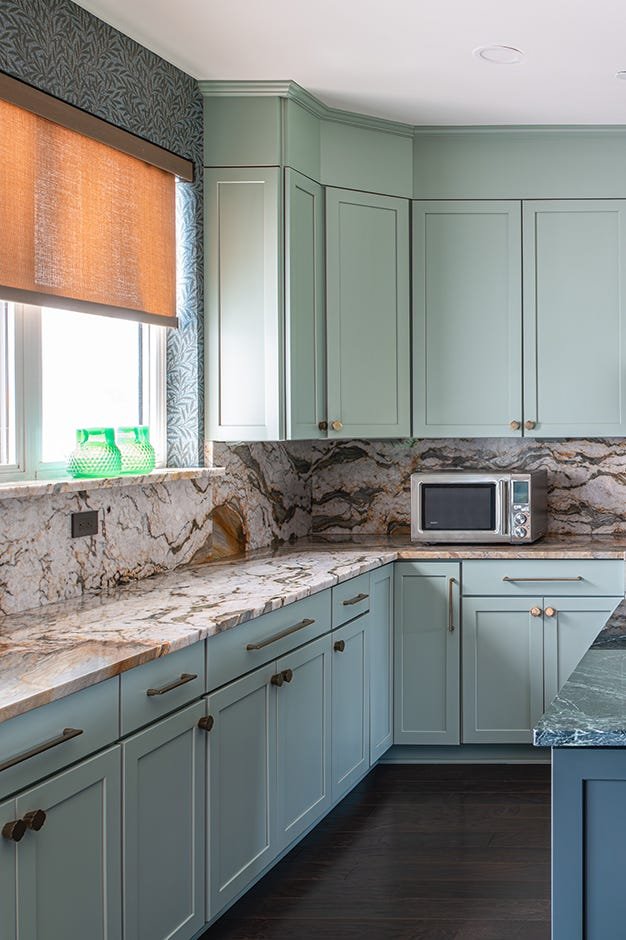
Popular Kitchen Colors
Choosing the right color for your kitchen sets the tone for the entire space. Popular kitchen colors offer a range of moods and styles. They help create a welcoming and functional environment. Below are some of the most loved color choices for kitchens today.
Classic White
White kitchens feel clean and bright. They make small spaces appear larger. White matches any style from modern to traditional. It reflects light well, keeping the kitchen fresh. Pair it with colorful accessories for a lively touch.
Bold Black
Black kitchens offer a sleek and modern look. They create a strong, dramatic statement. Black hides stains better than lighter colors. It pairs beautifully with metallic fixtures and wood accents. Use it for cabinets or countertops to add depth.
Neutral Gray
Gray is a versatile color that suits many tastes. It balances warmth and coolness perfectly. Gray kitchens feel calm and sophisticated. They work well with both bright and muted tones. This color fits well in contemporary and classic designs.
Warm Beige
Beige brings warmth and comfort to the kitchen. It creates a soft, inviting space for family meals. Beige pairs nicely with wood and natural materials. This color brightens the room without being too stark. It suits cozy, traditional kitchen styles.

Credit: www.housebeautiful.com
Bright And Cheerful Shades
Bright and cheerful shades bring life and energy to any kitchen space. These colors create a warm and welcoming atmosphere. They make the kitchen feel more inviting and lively. Choosing the right bright color can boost mood and inspire creativity while cooking. Here are some popular bright shades that work wonderfully in kitchens.
Sunny Yellow
Sunny yellow adds warmth and happiness to the kitchen. It reflects light, making the room look bigger and brighter. Yellow pairs well with white cabinets and natural wood tones. It creates a cheerful vibe that energizes the space. This color works great for walls, backsplashes, or kitchen accessories.
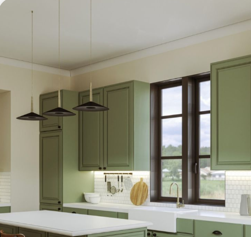
Fresh Green
Fresh green brings a sense of nature and calmness indoors. It gives the kitchen a crisp and clean look. Light green shades add softness, while deeper greens add richness. Green pairs beautifully with wood and stone elements. It creates a refreshing and peaceful cooking environment.
Energetic Orange
Energetic orange sparks creativity and enthusiasm in the kitchen. It adds warmth and a playful touch. Orange works well as an accent color on walls, cabinets, or kitchen tools. It pairs nicely with neutral colors like beige or gray. This shade makes cooking feel more fun and lively.
Vibrant Blue
Vibrant blue brings coolness and freshness to the kitchen. It creates a calm yet dynamic atmosphere. Blue works well on walls, cabinets, or kitchen tiles. It pairs perfectly with white and stainless steel appliances. This shade helps balance warm colors and adds a modern touch.
Soft And Subtle Tones
Soft and subtle tones bring calmness and warmth to any kitchen space. They create a gentle backdrop that makes the room feel inviting and peaceful. These colors do not overpower but rather enhance the kitchen’s natural light and design elements.
Choosing soft tones can make your kitchen appear larger and cleaner. They work well with wood, metal, and ceramic finishes. These shades fit modern and traditional kitchens alike.
Pastel Pink
Pastel pink adds a touch of sweetness without being too bold. It pairs beautifully with white cabinets and natural wood. This color creates a cozy, friendly atmosphere that feels fresh and airy. Ideal for kitchens seeking a soft, welcoming vibe.
Light Lavender
Light lavender offers a subtle purple hint that soothes the senses. It blends nicely with gray or cream accents. This tone brings a sense of calm and elegance to the kitchen. Perfect for spaces that need a gentle splash of color.
Cool Mint
Cool mint refreshes the kitchen with a soft green-blue hue. It works great with stainless steel appliances and white countertops. This color adds a clean, crisp feeling and a touch of nature indoors. Suitable for kitchens aiming for a fresh, airy look.
Powder Blue
Powder blue creates a peaceful and light environment. It matches well with light wood and soft gray tones. This shade brightens the kitchen while keeping it calm and soothing. A perfect choice for kitchens wanting a serene and gentle palette.
Credit: www.jswpaints.in
Choosing Colors Based On Kitchen Style
Choosing the right colors for your kitchen depends heavily on the style you want to create. Each kitchen style has a mood and personality that color can either boost or undermine. Understanding how colors interact with your kitchen’s design helps you make choices that feel natural and inviting.
Modern Minimalist
Modern minimalist kitchens thrive on simplicity and clean lines. Neutral colors like white, grey, and black work perfectly to keep the space sleek and uncluttered. Adding a splash of bold color, such as deep blue or emerald green, can create a striking focal point without overwhelming the minimal vibe.
Have you ever noticed how a single color accent can transform a plain kitchen into something memorable? Try using matte finishes to avoid reflections that distract from the minimalist feel.
Rustic Charm
Rustic kitchens call for warm, earthy tones that enhance the natural materials like wood and stone. Shades of beige, terracotta, olive green, and burnt orange bring out the cozy, lived-in atmosphere. You can also mix muted pastels to soften the rugged edges and add a touch of charm.
Think about how your color choices can mimic the changing seasons—warm colors for autumn vibes or soft greens for spring freshness. Does your kitchen’s lighting highlight these colors well?
Industrial Edge
Industrial kitchens often feature exposed brick, metal, and concrete, which pair well with darker, moodier colors. Charcoal, navy blue, and rusty reds emphasize the raw, urban feel. Using metallic accents in silver or copper can add contrast and break up the heaviness.
Do you want your kitchen to feel like a loft in the city? Try combining dark colors with polished surfaces to balance toughness with sleekness.
Traditional Warmth
Traditional kitchens benefit from classic, inviting colors like creamy whites, soft yellows, and warm reds. These tones create a welcoming space where family and friends want to gather. Rich wood finishes work well with these colors, enhancing the sense of history and comfort.
Have you considered how layered lighting can bring out the warmth of your chosen colors? Soft, warm bulbs can make a big difference in how colors feel throughout the day.
Color Combinations That Work
Choosing the right color combinations can transform your kitchen from ordinary to extraordinary. The key is to find a balance that reflects your style while creating a welcoming and functional space. Let’s look at some color pairing ideas that consistently produce stunning results.
Monochromatic Palettes
Using variations of a single color creates a sleek and cohesive look. Imagine different shades of blue—from soft sky tones to deep navy—layered across your walls, cabinets, and countertops. This approach simplifies decision-making and makes the space feel larger and more harmonious.
I once painted my kitchen in light gray tones and added darker charcoal accents; the effect was calming yet modern. Would you consider a monochromatic scheme to keep your kitchen subtle yet stylish?
Contrasting Colors
Pairing colors that stand out against each other adds energy and personality. Think of bright white cabinets paired with black countertops or a bold red backsplash against neutral walls. Contrast draws the eye and can highlight key areas in your kitchen.
Try combining warm and cool tones, like sunny yellows with cool blues, to create dynamic interest. What areas in your kitchen could use a splash of contrast to feel more vibrant?
Complementary Hues
Colors opposite each other on the color wheel often make perfect pairs. Classic combinations like green and red or blue and orange can bring balance and excitement. Use these hues thoughtfully to avoid overwhelming the space.
For example, soft green cabinets with subtle coral accessories can feel fresh without being too bold. Could complementary colors help you add a fresh twist to your kitchen decor?
Accent Walls
An accent wall lets you experiment without committing to a whole room. Choose a bold or deep color for one wall to create a focal point. This technique works especially well in kitchens with open layouts or simple color schemes.
Adding a burnt orange or deep teal wall behind open shelving can bring warmth and depth. Have you thought about which wall in your kitchen deserves that spotlight?
Impact Of Lighting On Color
Lighting plays a crucial role in how colors appear in your kitchen. Different light sources can change the way a color looks on your walls or cabinets. Understanding lighting effects helps you pick the best color that stays true and creates the right mood.
Natural Light Effects
Sunlight changes throughout the day, affecting color perception. Morning light is cool and blue, making colors look crisp and fresh. Afternoon light is warmer, adding a golden tone to colors. North-facing kitchens get softer light, which can dull bright colors. South-facing rooms receive strong sunlight, making colors pop and appear vibrant.
Natural light can reveal the true shade of your paint. Test samples in daylight to see how they shift. Colors may look different in direct sunlight compared to shaded areas. Keep this in mind when choosing hues for your kitchen.
Artificial Lighting Choices
Kitchen lighting includes overhead lights, under-cabinet lights, and fixtures. Each type emits different color temperatures that affect paint tones. Warm white bulbs add a cozy, yellow glow, enhancing warm colors like reds and yellows. Cool white bulbs give off a blue light, making cool colors like blues and greens stand out.
LED lights are popular for kitchens due to energy efficiency and variety of tones. Choose bulbs with a color rendering index (CRI) above 80 for accurate color display. Mixing light sources can create uneven color effects, so plan your lighting carefully.
Balancing Light And Shade
Shadows and light patches impact how color looks in different kitchen areas. Dark corners may make colors appear deeper or muted. Bright spots can wash out light colors or highlight imperfections. Balance is key to consistent color appearance.
- Use multiple light sources to reduce harsh shadows.
- Place task lighting near work areas for clarity.
- Consider reflective surfaces to spread light evenly.
Testing paint colors under your kitchen’s lighting conditions helps achieve harmony. This ensures your chosen color feels right at any time of day.
Tips For Painting Your Kitchen
Painting your kitchen can dramatically change its vibe and make your cooking space truly yours. But before you dip that brush, there are some key tips to keep in mind to achieve a flawless finish that lasts. Let’s walk through what you should focus on to get your kitchen walls looking fresh and vibrant.
Surface Preparation
Clean walls ensure paint sticks properly and looks smooth. Wipe down surfaces with a mild detergent to remove grease and grime, especially around cooking areas. If you spot any cracks or holes, fill them with a suitable filler and sand the area once dry.
Have you ever skipped prepping and ended up with peeling paint? It’s frustrating and avoidable. Taking the time to sand glossy surfaces will help the new paint bond better. Don’t forget to tape off edges and cover countertops to protect them.
Choosing The Right Finish
The finish you pick affects both the look and durability of your kitchen walls. Satin or semi-gloss finishes are popular because they resist stains and are easy to clean—perfect for kitchens. Matte finishes look modern but can be harder to wipe down.
Think about how much traffic your kitchen gets. If you cook often and kids are around, a more durable finish might save you from frequent touch-ups. Have you considered how lighting interacts with your chosen finish? Glossy paints reflect more light, brightening the space.
Diy Vs Professional Help
Painting your kitchen yourself can save money and give a sense of accomplishment. However, it requires patience and some skill to avoid streaks or uneven coats. If your kitchen has lots of trim, cabinets, or tricky angles, a professional might handle it faster and cleaner.
Ask yourself: Do you have the time and tools for a quality job? Professionals bring experience that can prevent common mistakes, but DIY projects offer full control over color choices and timing. Balancing your budget with your confidence level will guide the best decision.
Frequently Asked Questions
What Is The Best Color For Kitchen Walls?
Neutral colors like white and beige are popular for kitchen walls. They offer a clean, spacious feel and complement various kitchen styles. Light colors can make the space appear larger and brighter, while darker shades add warmth and coziness.
How Do Colors Affect Kitchen Mood?
Colors significantly impact the kitchen’s atmosphere. Bright hues like yellow or red energize the space, encouraging lively interactions. Calmer shades like blue or green promote relaxation and tranquility, ideal for creating a peaceful cooking environment.
Are Dark Colors Suitable For Kitchens?
Dark colors can add elegance and depth to kitchens. They work well in larger spaces, providing a sophisticated ambiance. Pairing dark shades with contrasting cabinetry or countertops can create a striking visual balance, enhancing the kitchen’s aesthetic appeal.
Why Are Neutral Colors Popular In Kitchens?
Neutral colors are versatile and timeless, making them popular choices. They easily match different decor styles and allow flexibility in changing accessories. Neutral shades like white, gray, and beige create a clean, uncluttered look, making the kitchen feel more inviting.
Conclusion
Choosing the right colour can brighten your kitchen space. Soft tones create calm, while bright shades add energy. Neutral colours suit most styles and stay timeless. Think about your kitchen size and light before deciding. Your choice affects mood and comfort daily.
Trust your taste and enjoy a fresh look. A good colour makes cooking and gathering more fun. Start with simple shades, then add accents for style. The best colour feels right for you and your home.

Hi, I’m Daniel Harper, a senior editor here at KitchenBucks.com. For over 10 years, I’ve been exploring kitchen gadgets and appliances to help people find tools that truly add value without breaking the bank. I love simplifying product choices so you can focus more on cooking and less on worrying about what to buy. When I’m not reviewing the latest gadgets, you’ll usually find me experimenting with coffee brewing or firing up the grill for a weekend barbecue.